

Responsive Web Design Westhoughton
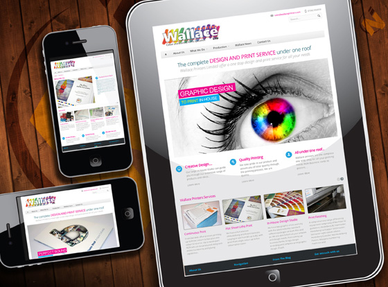
It has been predicted that in 2014 people using mobile devices to view websites will outweigh people using desktop computers for web searches. When local business and partner Wallace Printers of Westhoughton approached us in November 2013 and asked us to create them an aesthetically pleasing responsive website we jumped at the chance. They had seen what we had done with our own site and blog and really liked the positive results we had recieved. Wallace already had a current website which was created using flash which (all the rage many years ago). Sadly as the web progressed people reallised that flash sites weren't the future and you were left you with a website that was only good if people knew it was their in the first place.
What is Responsive Website Design?
Responsive web design is a way of making a single website that works efficiently on both desktop browsers and the multitude of mobile devices currently on the market. Responsive architecture gives the best quality browsing experience - whether on a smartphone, tablet, netbook or e-reader, regardless of the operating system. People who browse while on-the-go have very different needs than those sitting at a desk. Responsive web sites rearrange themselves automatically according to the device viewing them, so that the same website provides a great experience everywhere.
What's the dfference between mobile and full blown desktop websites
Desktops get a full-blown interface with videos, large images and animations. Smartphones get a simplified website that runs fast without the bells and whistles. Tablets and netbooks get something in between.
BLOG CATEGORIES
Social Share
AWARDS and Accreditations

